
Mobile-First Design: Where to Start
Why designing for small screens first makes the entire process easier. Covers the fundamentals of mobile-first thinking and how it improves your final design.
Free tools and techniques for checking your work on real devices. We’ll show you what to test first and what actually matters.

You’ve built a responsive website. It looks perfect on your laptop screen. But here’s the thing — your users aren’t all on laptops. They’re on phones while waiting for a bus, on tablets in bed, on old Android devices that your design system never accounted for. And you don’t need an expensive testing lab to catch problems before they become disasters.
The truth is, you don’t need to test on every device that exists. What you need is a smart strategy. That’s what we’re covering here. We’ll walk through the free tools that actually work, the devices you should prioritize, and the testing workflow that fits into a real freelancer’s day without eating all your time.
Device categories to test
Mobile, tablet, and desktop. That’s it. Focus here first.
Cost required
Every tool we recommend is completely free to start with.
Testing time per project
A focused testing session doesn’t need to take hours.
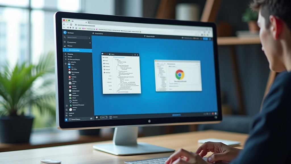
Every major browser comes with built-in device emulation. Chrome, Firefox, Safari — they’ve all got it. You’re probably already using these tools for debugging, but here’s the secret: the device preview is actually reliable enough for most testing work.
Open DevTools (F12 or right-click Inspect), hit the device toggle button, and you’ve got instant access to previews of iPhone 15, iPad Pro, Galaxy S24, whatever. The viewport sizes match real devices, the touch interactions work, and you’ll catch 80% of responsive design issues right there.
The limitation? It’s an emulation, not a real device. The browser engine is the same. So you might miss things like actual touch performance or how certain CSS behaves on Android Chrome versus the emulator. But for catching layout breaks and overflow issues? This is your first line of defense.

Here’s where emulation reaches its limit. Real device testing catches things that simulators can’t — actual touch lag, how the browser really handles certain CSS, performance on older hardware, and those weird rendering quirks that only show up on actual Android or iOS.
You don’t need to own an iPhone 12, iPhone 15, Samsung Galaxy A series, and a Pixel phone. That’s not realistic for freelancers. Instead, borrow devices. Ask friends, family, or colleagues if you can test on their phones for 15 minutes. Many coworking spaces have communal devices. Some testing libraries let you book time with real devices.
When you do test on real devices, focus on these things: tap targets and touch spacing, scrolling smoothness, form input behavior, and how images actually load. These are the areas where real devices reveal problems that emulation misses.
Quick Real Device Testing Checklist:
Beyond the browser itself, there are some genuinely useful free tools that’ll handle a lot of testing work for you. You’re not paying a penny and you’re getting professional-grade results.
Built right into Chrome DevTools. Run it and you get performance scores, accessibility checks, best practices, and mobile-friendliness validation. It’s not just about speed — it’ll flag responsive design issues, missing alt text on images, and other mobile problems you might’ve missed.
Free, open-source, and genuinely useful. Shows your site across multiple viewports simultaneously. You can see how your design looks on iPhone, iPad, and desktop all at once. Resize them all together and watch how your layout responds. This alone saves hours of manual switching between device presets.
They offer a free plan with limited testing minutes. You get access to real devices in their cloud lab — actual iPhones and Android phones that you can control remotely. Not unlimited, but perfect for spot-checking critical pages before launch.
These three tools together give you a complete testing workflow. DevTools for quick checks, Responsively for multi-viewport viewing, and real device testing for the final validation.


Here’s the practical bit. You can’t test everything equally. You’ve got a limited amount of time and energy. So prioritize.
Start with mobile. That’s where most traffic comes from these days. Your site needs to work flawlessly on phones. Then tablet — test landscape and portrait orientations. Finally desktop. If you’ve got time and it’s a complex design, add a test pass on an older phone running an older version of Android or iOS. That’s it.
For each viewport, you’re checking the same things: layout integrity, readable text, clickable elements, proper spacing, and image scaling. Don’t test every page exhaustively. Test the homepage, a couple of key pages, forms if there are any, and anything unusual in your design. Repetitive pages often behave the same way if your CSS is solid.
And here’s a time-saver: create a simple testing checklist and reuse it. Five minutes of checking the same critical elements on each device beats an hour of random clicking trying to figure out what you’re looking for.
You don’t need a fancy testing suite or a budget to match your development budget. Browser DevTools are genuinely powerful. Free apps like Responsively App save massive amounts of time. Borrowing real devices from people you know works perfectly well. And a structured approach — testing the right pages, checking the right things — means you’re not drowning in work.
Start with emulation for quick checks. Move to real devices when you’re confident in your layout. Use the free tools available. And build a testing routine that fits into your workflow without becoming a bottleneck.
Your clients don’t care what tools you used. They care that their site works when their customers open it on a phone. That’s what responsive testing is really about. And you can absolutely do that without breaking your budget.
Educational Note: This article provides informational guidance on responsive design testing techniques and free tools. Device testing approaches may vary depending on your specific project requirements, client needs, and technical constraints. Tools and services mentioned are subject to change and updates. Always verify current pricing and features directly with service providers. Testing requirements may differ based on your target audience and specific use cases.